I always try to create a few project linking to Read Across America Day. I begin by reading a Seuss book and then spiral off into a lesson in a few different ways. I will share a few of those lessons over the next few days and follow up with photos of student works next week as we finish them up.
For Kinders a lesson using
"One Fish, Two Fish, Red Fish, Blue Fish"
Materials:
2 - 9x12 pieces of paper (1 is taped to a firm surface where it will dry flat)
watercolors in warm and cool colors
black oil crayons
glue sticks
scissors
black construction paper for mounting
Week one - using warm or cool colors we create a patterned background. Pattern is a big focus for kindergarten so I try to support their curriculum as much as possible.
Week two - I begin by have students follow along with me as we draw a fish. I use my document camera for projecting on the wall for all students to easily follow along.
Using a black crayon or oil crayon, here are the steps:
Draw a large open "C" on the left of your paper
Connect a large "V" with the point toward the right
Connect a smaller "v" with the point touching the previous one with the opening facing right
Close the small "v" with a small "c"
Where the "v's" meet, add a smile on top and a frown on bottom to widen the space
Add angles to the top of the fish and the bottom of the fish for fins both dorsal and pectoral
Place a large oval near the front of the large "C" for an eye
Place a smaller circle inside of the oval
Personalize the fish with a smile, eyelashes fins, etc as desired
Decorate the fish using lines in a variety of ways, horizontal, vertical, zigzag, wavy, etc.
Students finish up by adding watercolor to their fish. If their background uses warm colors, the fish is cool colors and vice-a-versa. They really turn out beautiful, colorful and individual.
Finally, fish are cut out and glued onto the patterned paper from week one. The finished project is glued onto a black mat before display.
At this point I'd like to mention the website
Deep Space Sparkle because I think I initially found the ideals for this lesson on her sight a year or so ago, I don't know if I added my own twist or if this is the way she presented it.
A second grade Seuss lesson features the book
"My Many Colored Days"
This book is about color and emotions. I have color "people" that coordinate with the characters of the book. After the reading, we review the colors and expand on what the colors might represent to the students. I then share some cute monster teaching aides that I purchased that also reflect emotion through their face expressions. Each student is then challenged to think of a color/emotion combination to use as they create their own Emotion Monster.

Materials:
9x12 drawing paper
drawing pencils
sharpie markers
water based markers
construction paper
scissors
glue
Students will first brainstorm monsters on a scrap paper using pencils taking into consideration the facial emotions needed to match their color of choice. Once final decisions have been made, monsters are drawn on 9 x 12 paper to fill the space using a pencil and then going over with a black sharpie. Color is added with water based markers and then "spritzed" with water to add a textural effect. Monsters are cut out and attached to a colored paper of choice. This could be complementary to the color of their monster. The monsters are glue nearer to the top of the paper to leave room for a rectangle that will explain the emotion they are depicting. Students will first share their monsters with classmates to determine if their color and expressions portray the emotion they had hoped. Then a rectangle of white paper is created to show the word, in bubble letters that expresses their monster. These are colored to match the emotion and glued into place below the monster. I am using Kira Wiley's song
"Colors" to accompany this lesson. Here are the words:
 At a recent professional day experience, our group shared ideas for printmaking. One of my colleagues shared a variation of this project. She had planned the project as a color mixing experience for Kinders. With a twist, I introduced it to 5th grade students who totally enjoyed the color review and the opportunity to add individualized touches to their work.
 Week one student were given tempera colors in the primaries and instructed to paint all the colors of the color wheel. They were further told they could not mix colors on their pallets but instead had to mix right on the painting surface. There were not specific instructions as to how the finished work should appear, only that it should be non-representational.
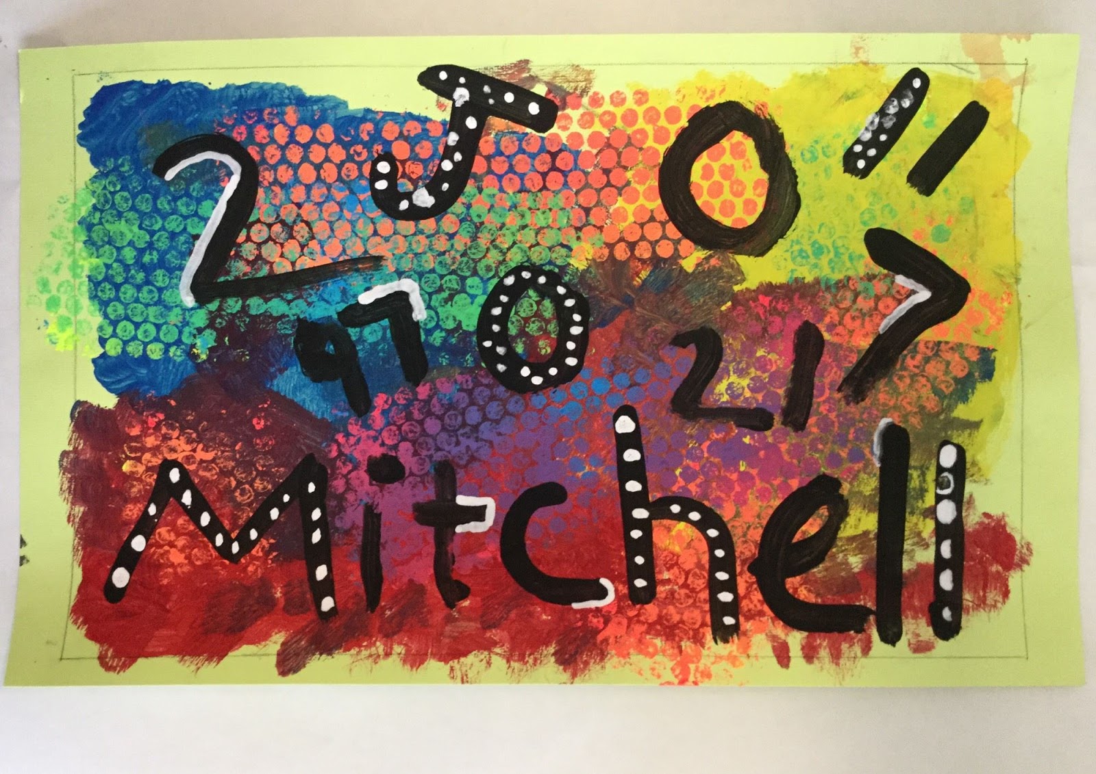
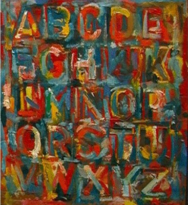
 Week two students used tempera in the fluorescent primary colors to mix secondary colors and print using bubble wrap. They did the mixing right on the bubble wrap. Very messy, but they all seems to really enjoy the bubble mixing process. (Paint one primary on each end of a strip of bubble, fold and rub the two ends together to mix.) At this step, they reviewed show colors "work" off one another and were reminded that complementary colors seem to "pop" when used together. Personal choices were made as to where to place the different color prints. As they completed this step, drawing paper was used along with any left over paint to practice painting letters and numbers using a flat paint brush.


