 |
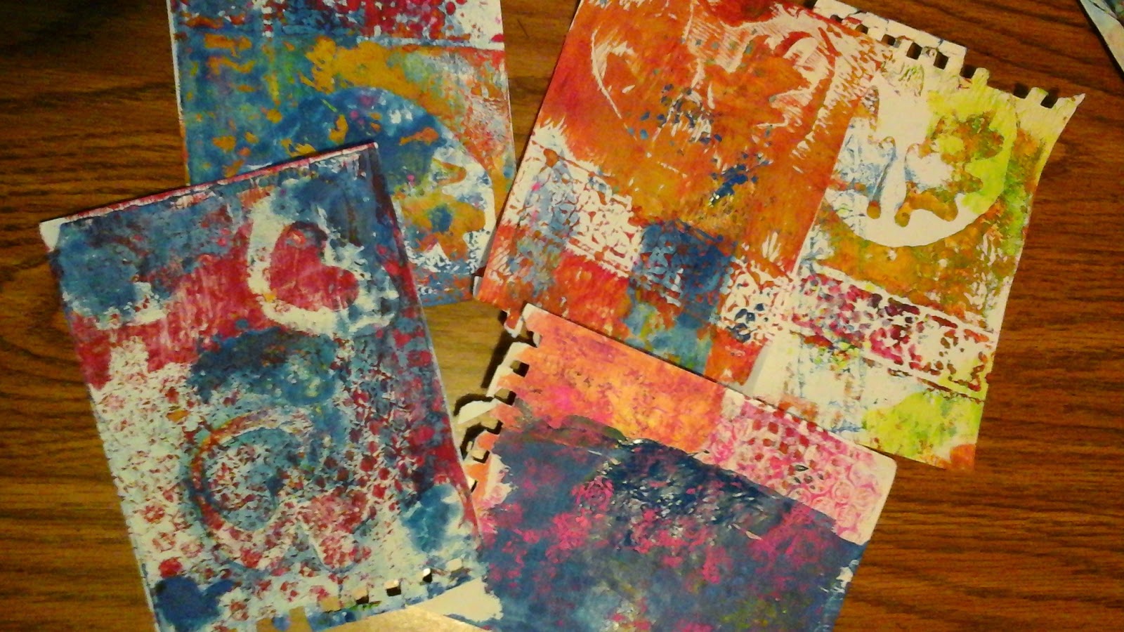
| Not so good prints |
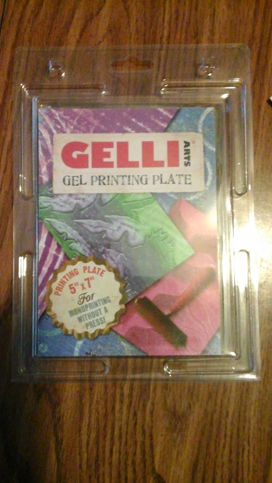
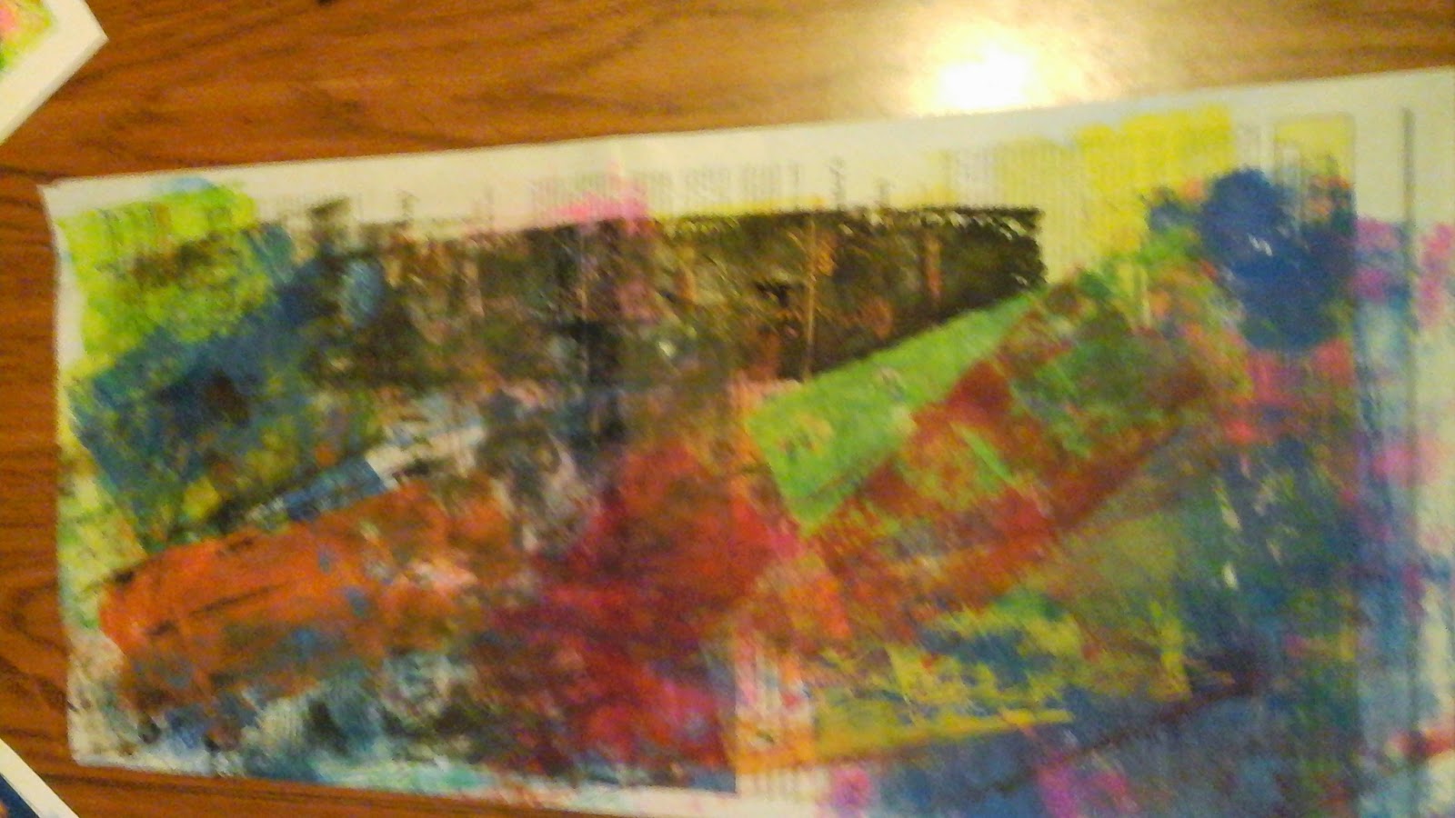
To begin, yesterday was a fabulous day, I posted myself in front of the big screen to view the AOE Winter on-line convention. I can't think of a better way to spend my day than being connected with fellow art teachers from all around the world, getting inspired and well, uh, educated. It's the next best thing to actually attending one of those face-to-face conventions like the one coming up in New Orleans in March. One day I'll be able to do that, too. Many weeks back I ordered a Gelli Plate. I kept reading about them, viewing all these wonderful instructional videos and seeing some amazing prints so I just wanted to give one a try myself. I ordered the 5 x 7 size and I am happy with my choice. Upon it's arrival I immediately opened the package, read all the directions and sealed it back up leaving it to sit on the side table in my living room where it has been for weeks. But today, inspired by all the wonderful of yesterday, I gathered up all of my tools and miscellaneous gadgets that might work for texture and headed to the kitchen table to finally try out that Gelli plate. After a few refresher videos to refocus on the process I began to "play". And, yes, it really does feel a lot like play. First I attempted just inking the plate using printing ink. Some of my ink has been around for awhile and either was too cold from being stored in the basement or was about to dry out because I really struggled with spreading it. I used bubble wrap, a onion bag, and some stencils I found in a craft drawer to see how I might do with masking. Quickly I discovered that I had jumped ahead of myself and I should be making my foundation prints using only color. I think I learn best from my mistakes, it sticks with me longer and as we all really know "There are no mistakes in Art only opportunities for creativity"! I eventually got the hang of the multiple layers of printing and masking to produce some of the effects I had seen in the videos. Oh, and thanks to the Sargent paints in my AOE swag box, I was able to make some really effective prints using acrylic paint. I did like the way the paint moved on the plate much better than the inks. I don't truly know if it was because the paints were fresher or if paint is really an easier medium to use this way. The yellow paint also stained my plate but it didn't add residue to subsequent prints so no bother. I read that it would come off with mild soap and water but it wasn't that bad of a stain and I didn't attempt to clean it. What was a surprise was that the plate picked up the ink from the newspaper I had laid out to protect my work surface. It does not appear to come off but again did not transfer to the prints. I had moved the plate off of the plastic surface I had it on to wipe up some ink and it was only on the paper a second...lesson learned. Clean up was very easy. I enjoyed attempting to pull as many ghost prints off of the plate as possible so there was not much ink or paint left on the plate to clean up. I can't wait to gather up some more stencils and other items to use for mask and try it all again. I do want to make sure I have a wider variety of colors available for the next round of printing.
 |
| Work in progress |
 |
| Used for Ghost Prints |
 |
| Used for Negative Prints |
 |
| Even the paper used to clean the brayer looks interesting |
I like the weight of the watercolor paper for the prints much better than the lighter sketching paper. Lastly, a few of my getting there prints. I had cut notches out of an old plaster credit card to use for the subraction printing, the curved lines, and the dots are from bubble wrap. I cut hearts out of the stencil sheets just using small craft scissors. So, there we have it.
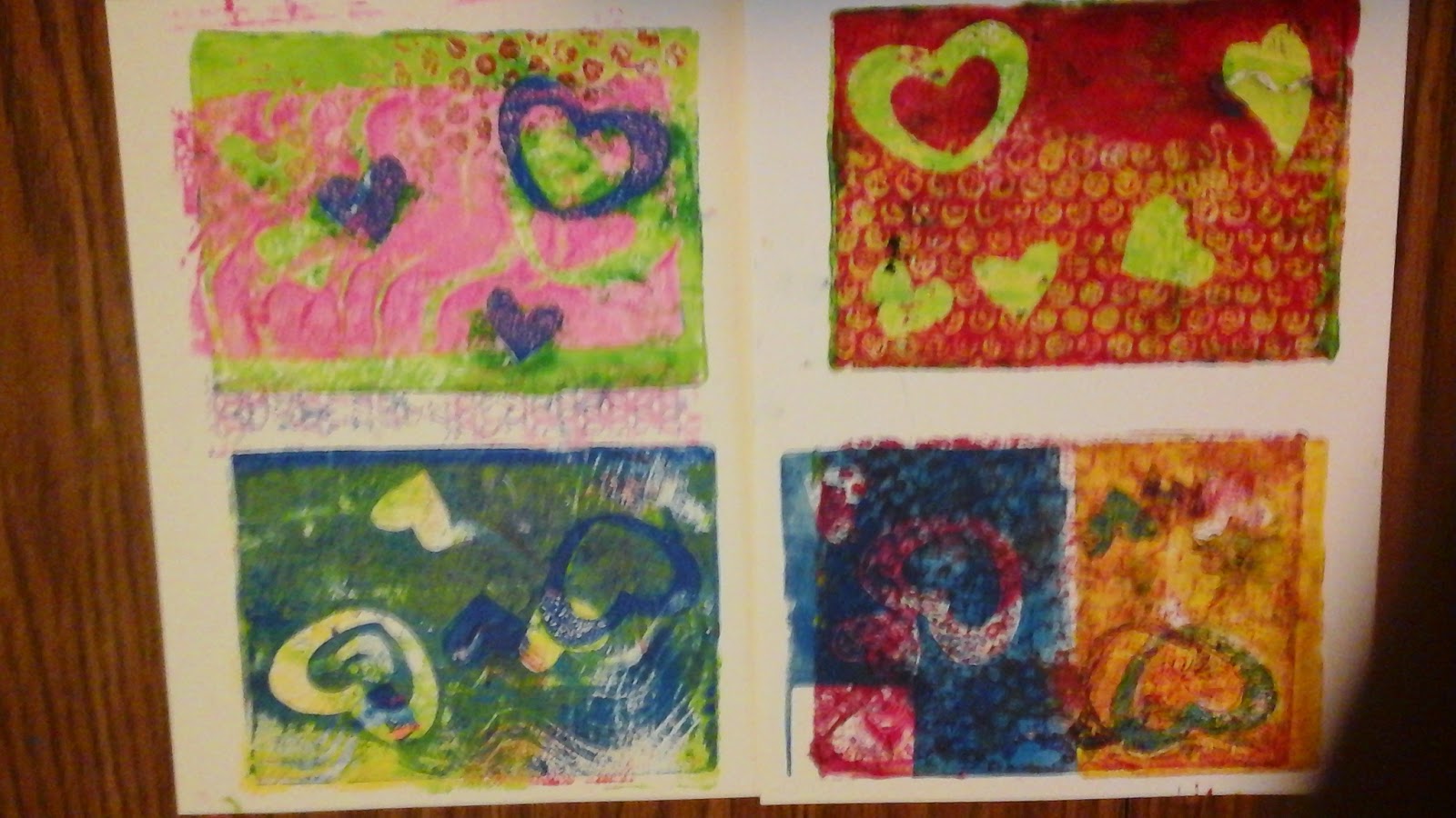 |
| Starting to get the hang of it. |
 At a recent professional day experience, our group shared ideas for printmaking. One of my colleagues shared a variation of this project. She had planned the project as a color mixing experience for Kinders. With a twist, I introduced it to 5th grade students who totally enjoyed the color review and the opportunity to add individualized touches to their work.
 Week one student were given tempera colors in the primaries and instructed to paint all the colors of the color wheel. They were further told they could not mix colors on their pallets but instead had to mix right on the painting surface. There were not specific instructions as to how the finished work should appear, only that it should be non-representational.
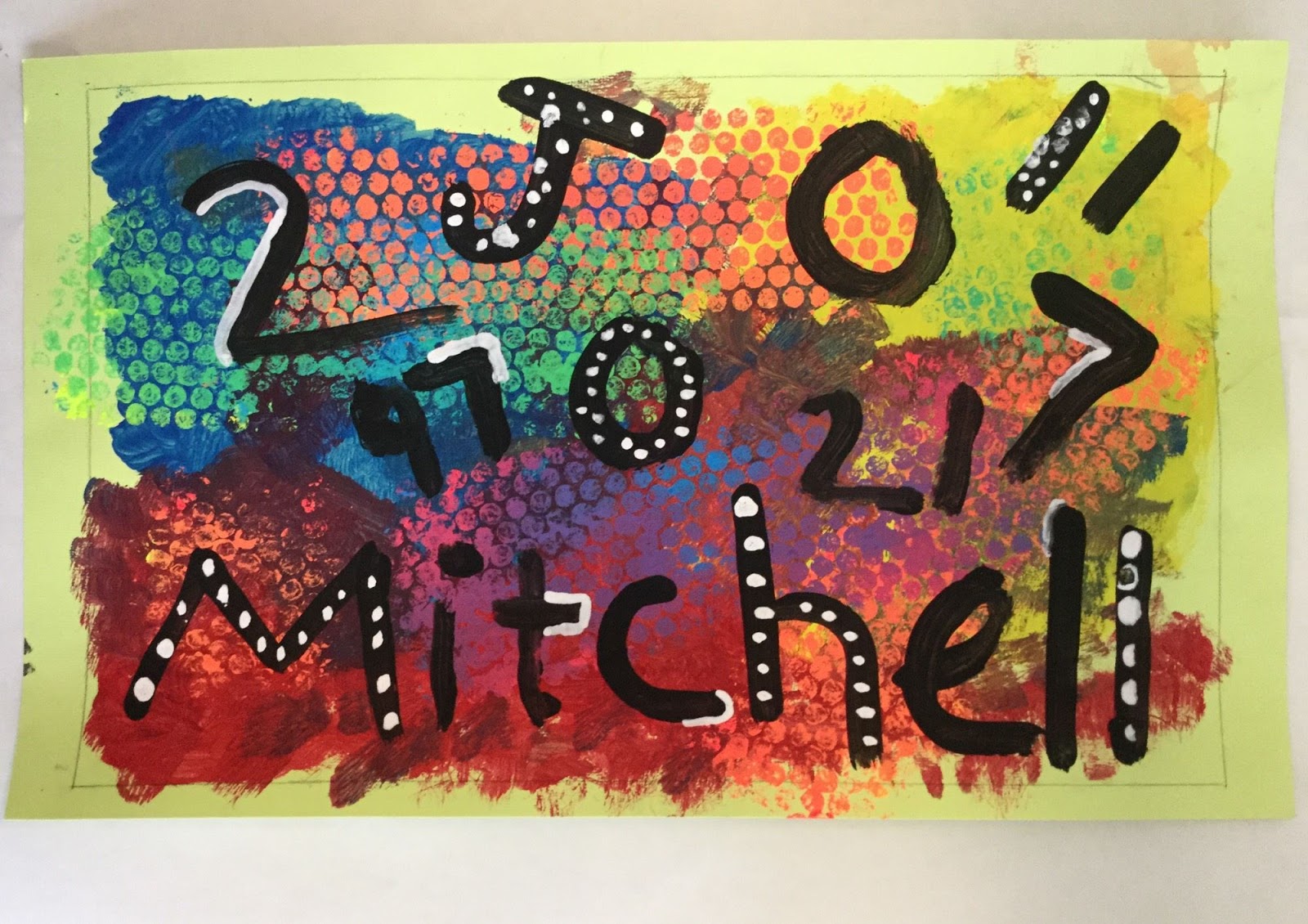
 Week two students used tempera in the fluorescent primary colors to mix secondary colors and print using bubble wrap. They did the mixing right on the bubble wrap. Very messy, but they all seems to really enjoy the bubble mixing process. (Paint one primary on each end of a strip of bubble, fold and rub the two ends together to mix.) At this step, they reviewed show colors "work" off one another and were reminded that complementary colors seem to "pop" when used together. Personal choices were made as to where to place the different color prints. As they completed this step, drawing paper was used along with any left over paint to practice painting letters and numbers using a flat paint brush.


.jpg)


