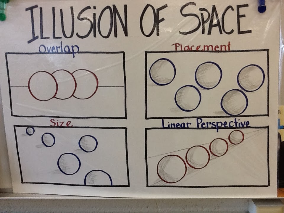
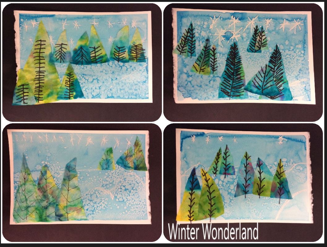
I found multiple references for this form of perspective on pinterest in the past along with this very helpful poster. I generally do a lesson on space or perspective with first and second graders at this time of the year using the terrific books of Caralyn Buehner, illustrated by her husband Mark. If you haven't check out the series, it is a must have in the art room. The short rhymes are catchy and cute and I am in love with Mark's wonderful illustrations.. Most all of them are done without using the color white even though most of the pictures are primarily of snow. It's a great way to get students to expand their thoughts concerning color and to maybe explore what they see in a new way. After the reading, we study the illustrations to identify the colors that are actually used for the snow and then investigate our own snow outside the windows to see if we can really see colors in our natural landscape. The discussion leads to shadow, reflection, and light and color.
First graders explore the multiple ways to show space. We use the words "Near and Far" in art so the poster is a very good visual. I decided to try the aerial perspective approach with second graders. First they cut three "snowballs" from white paper to form their snowmen. Oil pastels were used to colored around the edges of each circle so they would be visible when stacked to form the snowmen. Constructions paper was used to collage the features of the snowmen. Consideration was given to the direction the snowman would be looking. You can see from the student works, some look forward, some look up. Finally, snowmen were glued on a dark sheet of construction paper and splatter painted using white tempera and a toothbrush to create the appearance of falling snow. The students really enjoyed this project. First graders are still working; I'll post some of those when they are completed.




 We just completed our first week of school, 2 1/2 days with the students and we are off and running with projects for International Dot Day. My teaching focus for this year will be writing artist statements using great artistic vocabulary and connecting and understanding the Elements of Art. My older classes experienced a few AHa moments as we reviewed the elements of art and reflected on how our art making projects had incorporated multiple elements throughout their years. The students caught on as they began to remind me of their favorite projects and what they had done to represent the various elements. The big one was Form and the realization their clay projects from previous years were classified as forms. I planned to have each grade connect to the elements in a conscience way with their "Dot" compositions. The one on the left is from a fourth grade student. The assignment was to demonstrate space in their composition. We review past concepts of placement on the page, overlap and size to show space. The small works (4" x 4 1/2) were then framed in a swirly frame as in the book "The Dot" by by Peter H. Reynolds.
 I will share other projects as they are completed. Fifth grade students are being challenged to create a composition that will reflect three of the Elements. They will then write an artist statement defending their choices and explaining why they chose the Elements. Third grade students are creating a dot based on something they might have experienced during the summer based on the dot shape. I was particularly amused by some of the ideas they came up with for their dot. I will share when they are completed, you must see the ferris wheel! Second graders have turned their dot into a symmetrical image reflecting positive and negative spaces as they practiced effective use of scissors. First grade classes have analyzed color mixing, some by creating a dot only colored with the primary colors and others by designing an original color wheel. They used the primary colors to mix the secondary colors on the wheel. I am hoping to have bulletin boards full of dots by September 15th for International Dot Day and prior to Meet the Teacher night.
 I found multiple references for this form of perspective on pinterest in the past along with this very helpful poster. I generally do a lesson on space or perspective with first and second graders at this time of the year using the terrific books of Caralyn Buehner, illustrated by her husband Mark. If you haven't check out the series, it is a must have in the art room. The short rhymes are catchy and cute and I am in love with Mark's wonderful illustrations.. Most all of them are done without using the color white even though most of the pictures are primarily of snow. It's a great way to get students to expand their thoughts concerning color and to maybe explore what they see in a new way. After the reading, we study the illustrations to identify the colors that are actually used for the snow and then investigate our own snow outside the windows to see if we can really see colors in our natural landscape. The discussion leads to shadow, reflection, and light and color.


